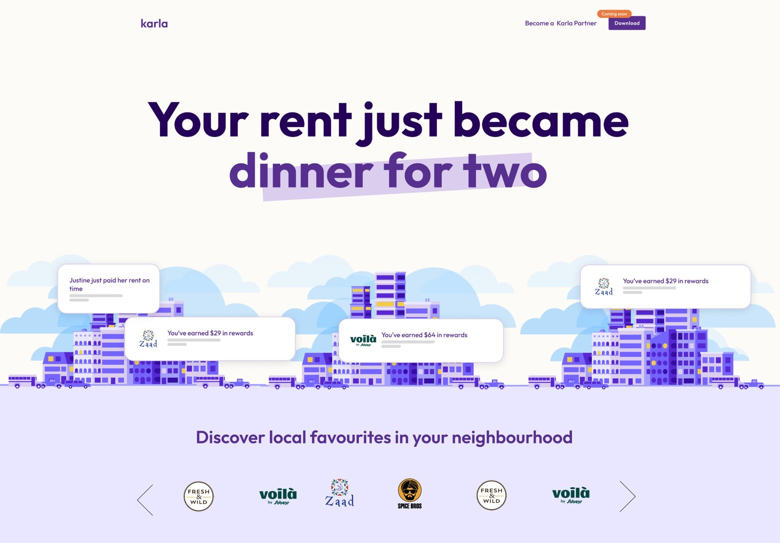
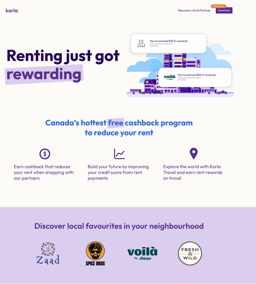
Rewarding Canadians for renting
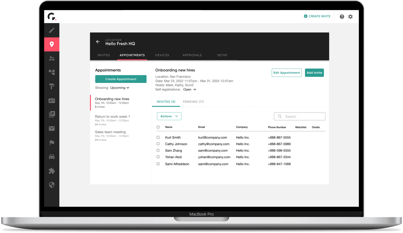
Company
Karla
Industry:
Fintech
Role:
Product & Web Designer
Timeline:
1 month
Platform:
iOS / Web
Tools:
Figma
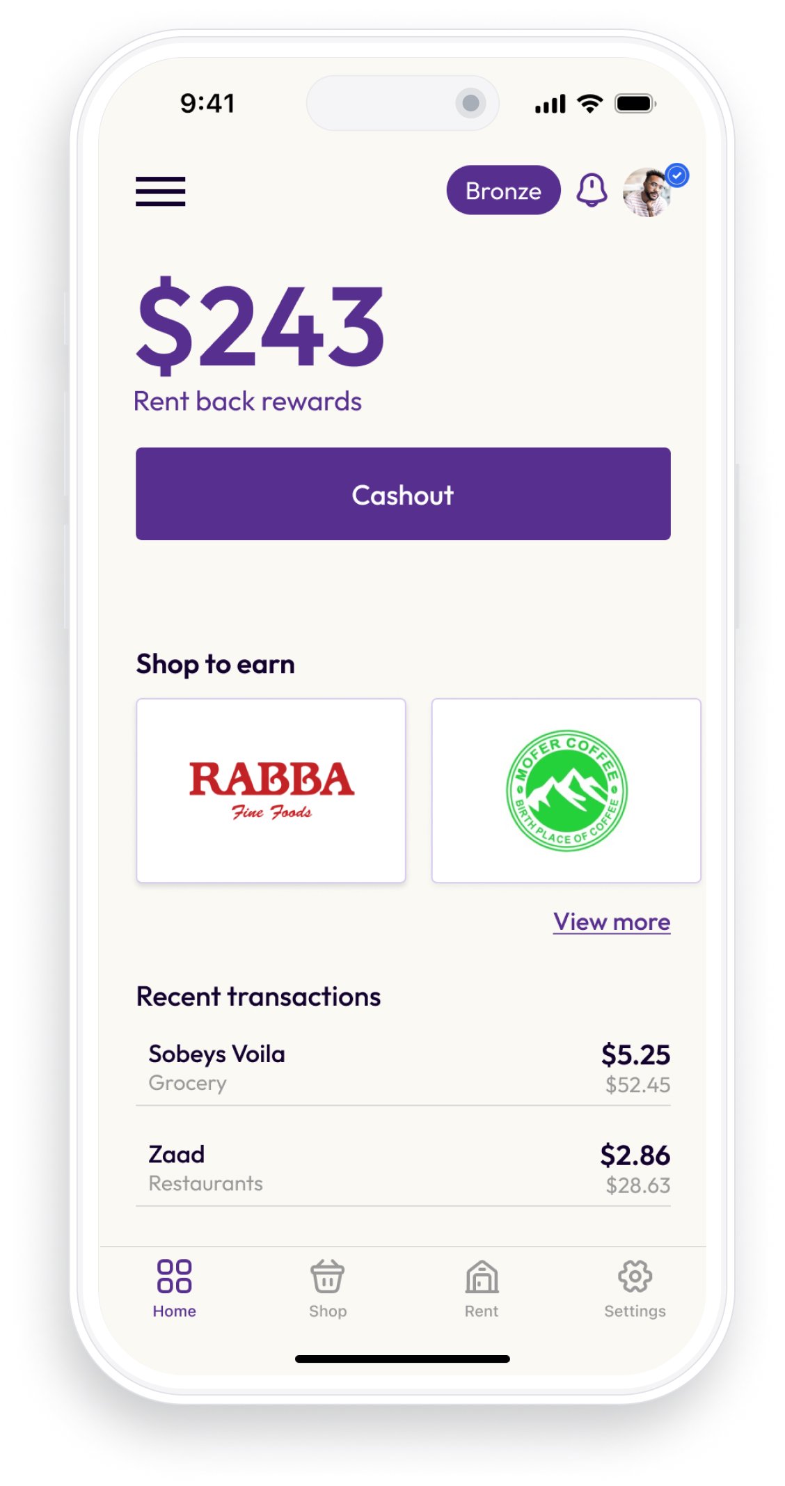
On a mission to become Canada's first rewards program for renters to earn rewards towards their rent by shopping at retailers such as Footlocker, Sephora and Sobeys through their mobile app. All this while helping Canadians build their credit score by reporting their rental expenses.
Reduce your rent
by shopping locally
Karla website
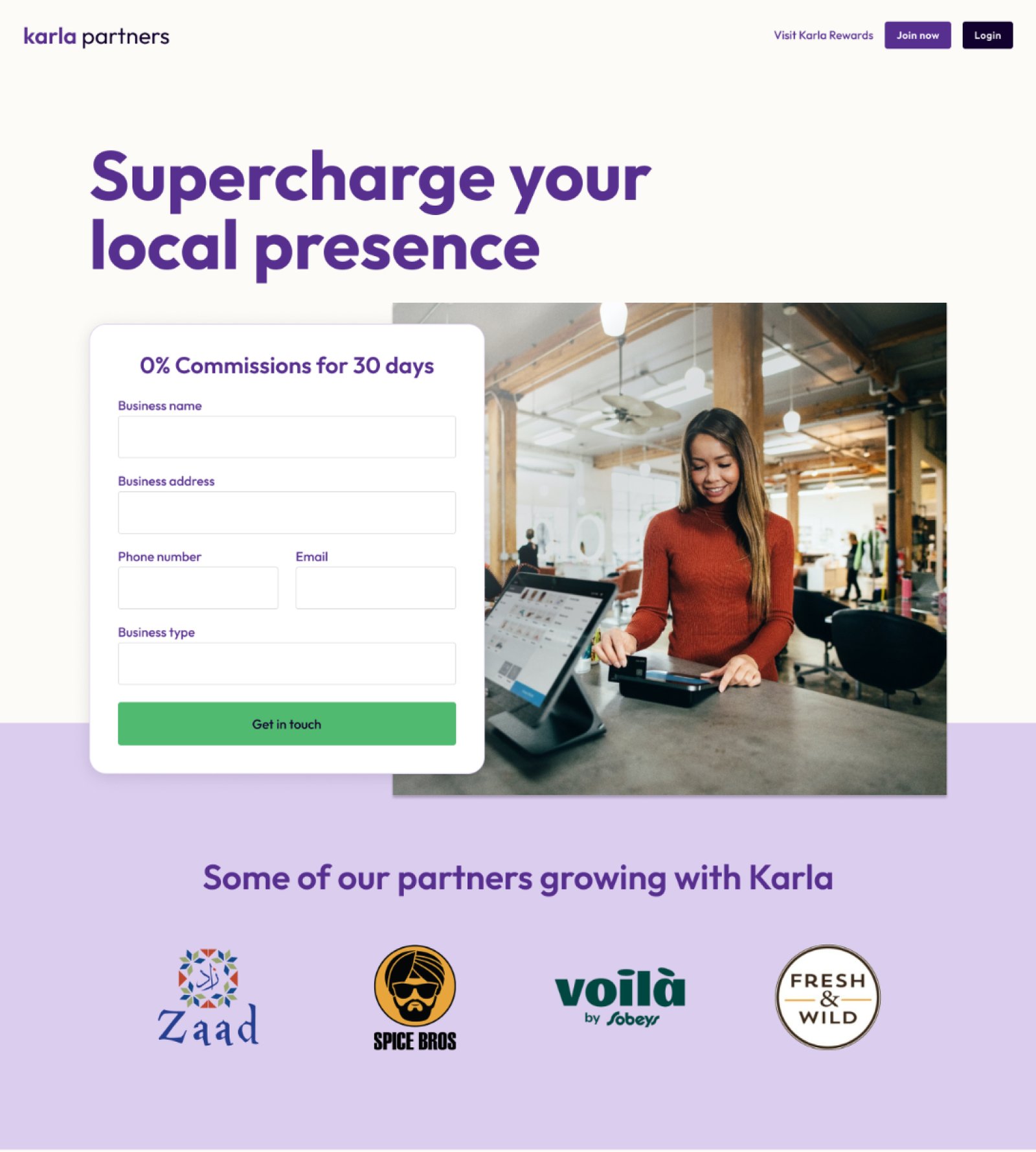
Karla Partners website
PROBLEM
While Karla had a defined business model, they struggled to communicate their value proposition for both their mobile app and website.
CHALLENGES
- Tight deadline: With the launch of the business pending, we had to be efficient.
- Juggling multiple hats: As a solo designer I had to wear many hats, researching, planning, copywriting and designing and communicating solutions to the Karla team.
- Timezones: The development team was located in the opposite timezone, in Dubai. This made timely communication a challenge. ( but I was able to lean on the founder to facilitate)
- Lack of users: There was a lack of a userbase pre-launch to obtain feedback from.
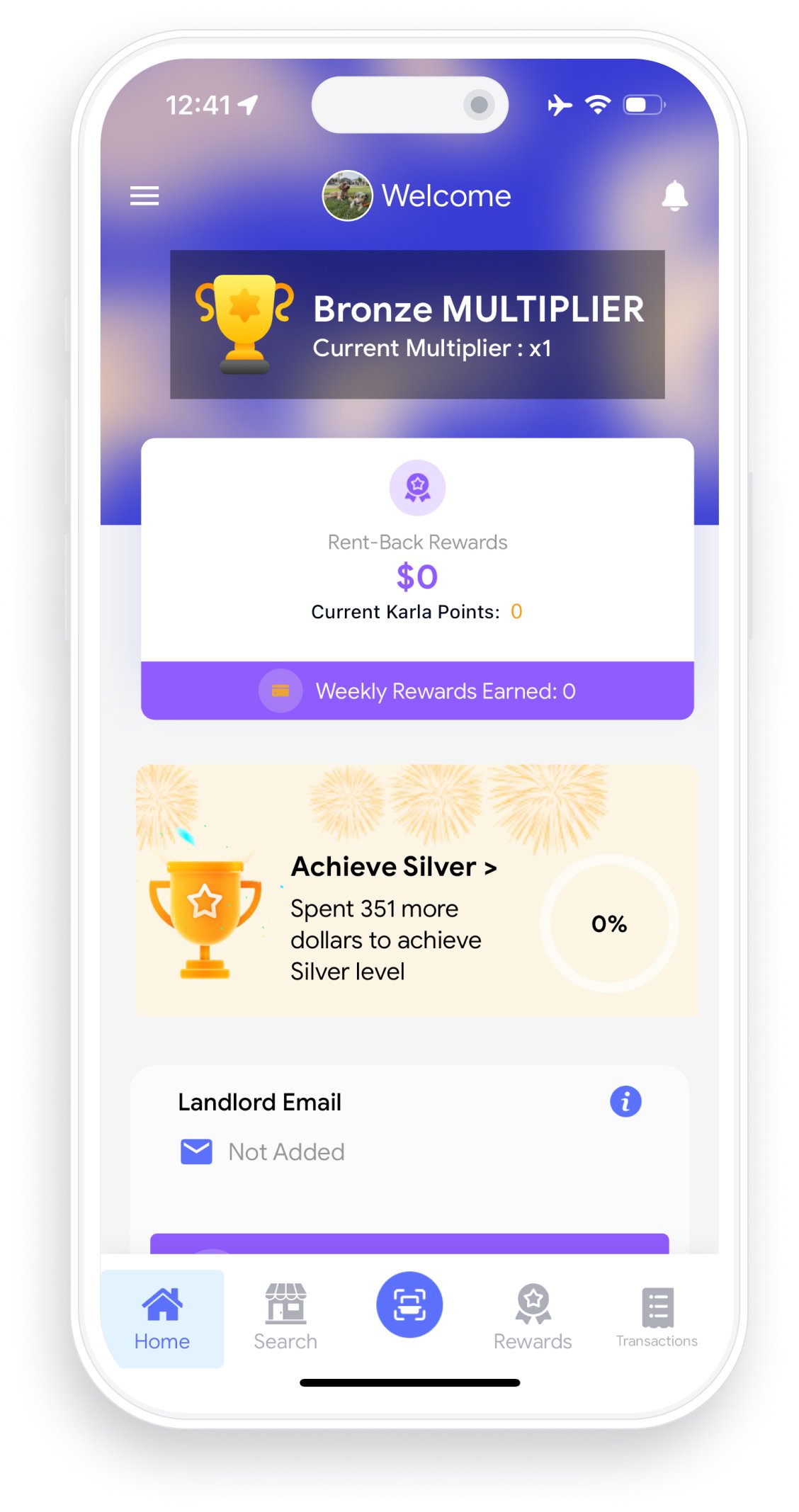
It was imperative that I had a good understanding of what actions Karla wanted it's renters to take in app. Working closely with Robin, Karla's Founder, led me to laying out all the information as an information architecture to help map the future of Karla's mobile app.
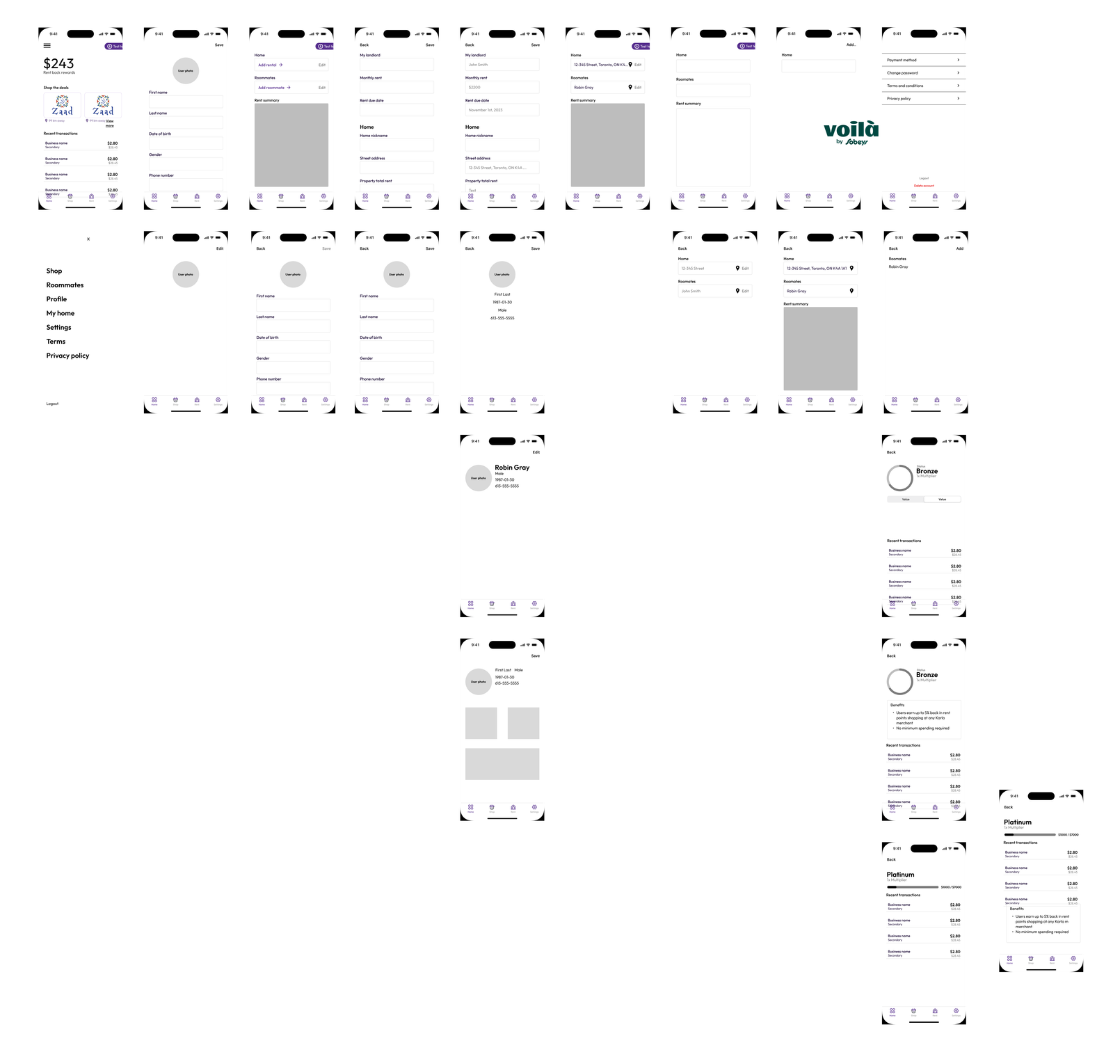
With better organizing the information we could help the renters focus on specific tasks like shopping or understanding the total amount of rewards they accumulated. Improving the visual design of the components and text hierarchy helped achieve this.
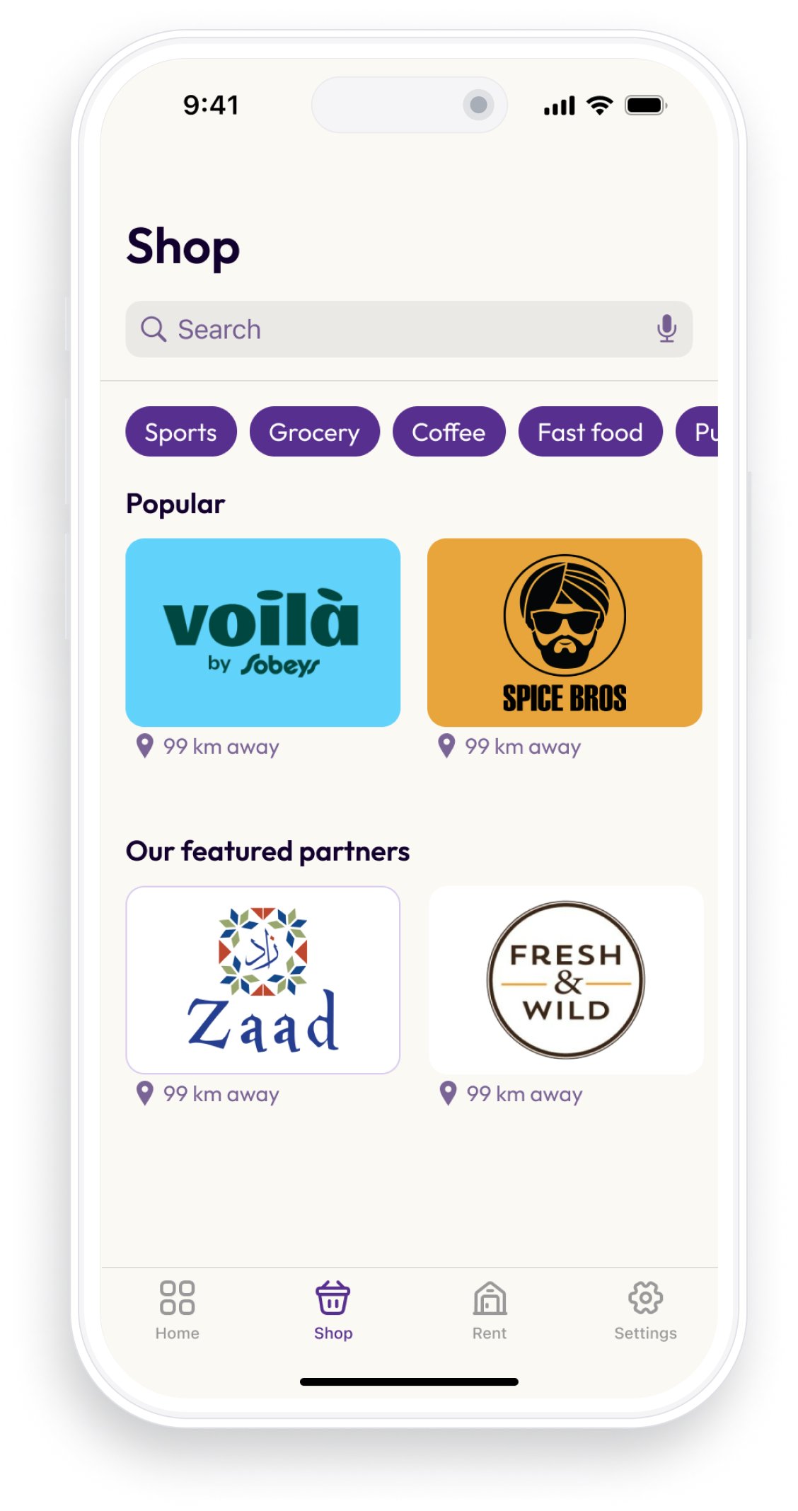
In the absence of users I leaned on best practices in mobile app design following iOS human interface guidelines. Post launch there were plans to embed a survey to gain direct feedback from users
In the absence of users I leaned on best practices in mobile app design following iOS human interface guidelines. Post launch there were plans to embed a survey to gain direct feedback from users
In the absence of users I leaned on best practices in mobile app design following iOS human interface guidelines. Post launch there were plans to embed a survey to gain direct feedback from users
WHAT WE LEARNED
With respect to the website, the messaging still felt disjointed - I suspect that confusion between Karla being a cash-back rewards service versus a company set out to help Candians have less expensive rent. A better job to blend the two messages to better connect with renters and shoppers could be done.